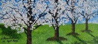
A couple of my friends got married in the past few months and I wanted to gift them paintings. Being lazy, I decided to paint three versions of the same painting. The advantage of having different versions of the same is that one can experiment with techniques and composition and see what pleases the eye best.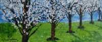
Now, I have a request: Could you try and rank the versions based on your preference? Through your honest feedback I would love to see what works best. If time permits, also explain why you prefer one over the other. Based on the results I will paint the same painting in a bigger canvas. Ready to vote?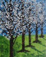
Sunday, April 23, 2006
Spring Paintings
Subscribe to:
Post Comments (Atom)


26 comments:
very clever moderating arv! ha ha.. i like the 3rd for the composition, then the 1st (nice 'closer' look), and the 2nd (still nice tho..). lucky friends to get your painting as gift! i still struggle with blogger.. it called my creativity!
Dear Friends,
I shall post your comments shortly. Giving everyone a chance to opine without being influenced by others' views.
Thanks for your patience!
My ranking:
1. Painting 1
2. Painting 3
3. Paiting 2
I don't know anything about the techiniques of painting, so my vote is according to what looks best to my eyes. And I liked painting 1 the best cos, the trees there look more filled with blossoms and the day looks more clear than in the other two.
Okay here is my honest comment. I prefer pic no:3 the vertical one (http://photos1.blogger.com/blogger/5613/1570/1600/IMG_1306.jpg).
For some reason, the others (1 and 2) looked like amateur work. But the third one rocks!
I would vote for the first one...Comparing the size and the number of trees you tried to accomodate,i feel, it has come well..Other thing is the color, in the first one. i feel more focus is on the flowers, which makes it look colorful :-))(the green and white combi)
Anyway even the second and third also grabs the attention :-))
The paintings are very similar. I tend to prefer the wider two paintings as they make me feel more like am in the painting than the tall one. I like the brightness in the foreground of the first one most. The somewhat fuller trees in the foreground are nice in it as well. However, I like the greater sense of distance/depth in the second painting. The third one feels more claustraphobic compared to the wide ones.
I like the shadows in the second painting best also.
So, in terms of composition I like the second one best and the value in the foreground of the first is best.
Although, I do feel that all the compositions are fairly simple. Your Autumn paintings from earlier have more interesting compositions.
Hi Arvindh,
I often do these same subject series of paintings too. I start with a pencil sketch and then proceed through three paintings, improving the composition,palette and brushwork as I go.
Thanks for visiting my blog and for the kind comments. You have a great blog.
Love,
Linda
NIrmala (http://nirmla.blogspot.com/) said:
I like the first version ..the view
appears more attractive and pleasing then the two..and it seems to b in
full bloom compare to others,this wud b first rank and second is 3rd rank and 3rd version il give 2nd..hope iam not confusing...like ur idea of painting it in different versions ..nice paintings tho..it wud b grt when u paint on bigger canvas but let c the votings...
Ujwala (http://blogschmlog.blogspot.com/) said:
my vote - I like your composition in option 3. :D
I like the second one because it has a very good rithm.
Thanks for the visit and comments.
Hiya arvindh..all 3 are gud ones..but liked the 3rd better..gives a larger sense of the whole picture..the other two..though placed horizontaly give a cramped look..but i lke the 2nd too..shows more of the shadows and is looking more developed than the first..
Hey Arvindh, I would like to know your ranking too, so that I know how an artist evaluates his composition. And also explain why.
Hey wow
Great work!ur an artist!
All 3 are grt...but prefer the second one..looks more spaced and less cluttered...
Somehow I like painting which are clear and less cluttered!
Arvindh-
I prefer the middle piece, the one with 6 trees. The depth (elongated landscape feeling) is more comfortable to me. However, I believe you could do another trio and make them an actual set that goes together. All are pleasing.
Thank you everyone for taking the time to respond. Was very interesting to note the diverse preferences. Will respond individually pretty soon. Meanwhile here are my rankings:
1.painting 3
2.painting 2
3.painting 1
I started doing painting 3 as a try-out work. i wanted to see if the colour scheme and other painting application techniques worked. I was not going to give that away (hence chose the inferior canvas board as opposed to the stretched canvas on which the other two were painted) and was very casual about my work on that. Painting 1 was the one where I thought I got the hang of it - it was done last and I wanted it to come out best. However when I was done with them all, I prefered the carelessly executed painting 3 - I thought it had a pleasing composition (roughly seems to follow the golden section - though I did not consciously seek to compose that way), painting 2 had scope for shadows to play a good part in the composition - so I preferred this next, painting 1 does not have long shadows. But then many of you like it for the abundant flowers!
Will write more shortly.
Results:
Painting 3 - 5 votes
painting 1 - 4
Painting 2 - 3
Mad Guru
I agree with you - these paintings are not as interesting (composition wise) compared to the fall ones.
Mary Horn,
I did like the paintings as a set!
excellent series and when your colour works it truely works for you.
You are very tallented. Kudos. All of them are great work. Given a choice I prefer the second one.
I liked all your art works. Kudos again.
Hi Arvindh, I think endeavouring to paint the same painting over and over again to get it right is the total opposite of laziness!!! I like the bottom one most because I like the sense of space and perspective from the trees when they are this height. I like the top one second because it also gives an interesting perspective, but not as much of a sense of space and I like the middle one least because it seems a bit darker. Still, all three are fantastic. Love the vivid colours.
hey arvindh,wud love to to get an expert's opinion on my watercolor and suggestions for improvement..have posted it in my art blog..do drop by when u have time..thanx
I think the first one has the brightest colours, but the third one has more space for the trees :)
I like them all, but the first one I think the best.
These are beautiful !!! :) I really like them !
bingo and betty, dubukku, tammy hanna, gudbrandsdottir, sheri burhoe
Thank you all very much!
Meghjanmi,
I have left my comments there.
the third version is my favourite, the first two look cramped,
wonderful idea for a wedding present
Post a Comment