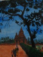
This is a small (11X14) acrylic on paper done in 2001. If I painted this today it would look very different - not only because the tsunami has forced some changes to the landscaping in the area adjacent to the temple, but because I think there are some shortcomings (for instance, in use of colour) in the painting that I would probably try to overcome. It would be great if you could comment on what could be done differently to improve the painting. Awaiting your feedback.
(I am sorry that this is the best photograph I can come up with for now. Light reflected from the glass behind which the painting is is a distraction.)
Tuesday, May 09, 2006
Mahabalipuram
Subscribe to:
Post Comments (Atom)


15 comments:
arvindh, this is truly lovely. The shore temple looks wonderful and the tree most of all. The only thing that i can think of is in terms of the composition. I feel that it would've been even better if the hedge was not blocking the temple.
arvindh,to be more natural i think the sky color ought to be muted,am i rite?but then,i also think it's ur signature..bright,warm and vibrant..:)
... the way to become a better painter is by painting more, your there arvindh, keep using colour the way you do and doing a series is a huge way to see what your doing and don't think too much about what you painting, let it surprise you too! excellent man!
Arvindh, I love it. Can't pin-point the errors. :-)
This certainly looks more amateurish compared to ur professional looking ones now. There seems to be slight problem with the scale. I don’t know if it’s the problem with my eyes or maybe u meant it to be that way. The tree is as brilliant as ever. I love the way u paint trees.
Beautiful work ~ I love your use of color and contrast!
I dont know wat changes to be done the painting looks beautiful as it is and the colors are luvley..may be it would be great if it was painted on big canvas.
Ujwala,
I am actually not happy with the left hedge - it does throw the composition off a bit.
Alexis Leon,
Thank you!
Meghjanmi,
Yes some variation in the blue (say with clouds) may have helped make it look more realistic.
Bingo and Betty,
I love your advice! yes letting go is very important to feeling great about Art and also making satisfying fulfilling Art.
Jo, Amy Zaleski, Nirmala,
Thank you all very much.
Suji,
You are right - some of the people I have rendered here and the choice of some colours does make this look amateurish.
I for one feel that I should not have used that bright orange for the person in the far right of the painting - that distracts the eye from the temple, the tree trunk and branches could have used some reflected lighting to show form and interesting textural effects and, lastly, shadows could have been used to make the composition more interesting.
Well, I like the colors...they remind me of the sky as nightfall just begins to set in. I am not someone who really concerns myself with what is "realistic". I would say maybe relocate the hedge on the right as it obstructs the path to the temple, since the temple is your main focus.
I love the tree sillhouette, very beautiful!
I like this piece, but if you're looking for feedback, I'd say you could create more depth with color. The color is quite flat. If you use some subtle color to create atmosphere you would create a greater sense of the size and distance.
i love how stylized this work is...whether that be the intention or not...there is something primitive in the nature of the subject and thus the treatment of it...i wouldn't change a thing abt it.
Mad Guru,
Thank you for the feedback.
Bess,
Thank you very much. Welcome to Blogger!
I love this.
Hi. that is awesome work..
Work from home
Post a Comment