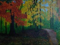
This is the first painting I painted in the first year of my being in the United States (4 years ago). Also, this is my first "big" painting. I had never before attempted anything on 24X36 inches canvas. I found the process very daunting and the end result not very satisfying. I look forward to hearing suggestions for improvement from you. Thank you.
Friday, May 19, 2006
First fall painting
Subscribe to:
Post Comments (Atom)


12 comments:
woo hoo, you're amazing pal, I like every single piece of your art work..
Mind Blowing .. awesome !! No words .. first time here.
got in here from Jo.. way to go !!
too good ..
Cheers,
Barani
Hi,
Saw ur comment u had left in my blog. Thanku! Was it just the Photo which was nice...Was not the Pots nice ;) And i do a little art work myself. Recently interested art was Glass painting ,. u cud see them in my NOV-DEC ( I think) Posts I believe.
//24X36 inches canvas. // So wonderfull! The work is an excellent piece!!
//.. and the end result not very satisfying.// Thats Bad u call like that. It looks Fablous!!! It hardly looks like a painted canvas...It looks like a photograph :) Nice Job!! Keep it up!!
Beautiful work arvindh ur too gud vt colors ,ur first big painting is awesome.Wat inspired u?..i know how u will be feeling when u start to paint on big canvases!!
I can't find anything wrong in this (I leave it to art critics) but man, this is a greaaaat work. Looks like a picture. I want to go into the woods now!!!
"The woods are lovely, colorful and deep"
(with apologies to Robert Frost)
Awesome!!! Don't know why you were not satisfied. It seems perfect to me. :)
I agree with the others - this painting is lovely. You seem to have a way with trees :P lovely artwork. Looks like I have a lot of catching up to do!
This is a nice piece. I like the color and contrast. There's some really nice light hitting the path, and some nice dark areas in the distance that contrast beautifully with the green in the forground. For the sake of a critique, I would say you could add more depth in the orange and yellow leaves by using some darker hues to push some of the further leaves on each tree further back in comparison to the closer leaves. This would need to be very subtle I think, but may add a bit more to the piece.
Great work.
not an expert at all..
so feel free to ignore my comment
may be those bright colors needs to be harnessed to give a reality effect?
Srini, barani, jo, lorraine_alvarewz, Ujwala,
Thank you all v much!
Marutham,
Thank you. BTW, I did enjoy your post too.
Nirmala,
This is based off of two of my fall photographs.
Suji,
Thank you for the appropriate quote!
Madguru and Dubukku,
Thank you both for your feedback.
I really like all of your fall paintings. Autumn is my favorite time of year. You have done well to create that feeling.
You have some very nice pieces... I am not much of a painter but have always appreciated those who can. Thanks for your comment on my space. As for a little advice on your "large" and daunting piece: While the colors are beautiful and it's a great subject ( I love trees also ) The bottom part of it seems to be a little too dark. You should probably add a few highlights to parts of the tree trunks just to bring them out a LITTLE...since the tops of the trees are so bright it makes you feel as though the sun would be peeking through just a bit more.... Keep up the great work ...Kristin
Post a Comment